Archive for the 'testing' Category

Crowdware

At the functional testing tools workshop, Ward Cunningham devised a scheme. John Dunham, Adam Geras, Naresh Jain, and I elaborated on it. Before I explain the scheme, I have to reveal the context, which is different kinds of tests with different audiences and affordances:

text flowing into text

This is your ordinary xUnit or scripted test. The test is at the top, the program’s in the middle, and the results are at the bottom. In this case, the test has failed, which is why the results are red.

The scribbly lines for both test and results indicate that they’re written in a language hateful to a non-technician (like a product owner or end user). But you’d never expect to show such a person failing results, so who cares?

a textual test produces a binary indication of success

Here’s the same test, passing. The output is just a binary signal (perhaps a green bar in an IDE, perhaps a printed period from an xUnit TextRunner). A product owner shouldn’t care what it looks like. If she trusts you, she’ll believe you when you say all the tests pass. If she doesn’t, why should she believe a little green bar?

A Fit test

Here’s a representation of a Fit test. Both the input and output are in a form pleasing to a non-technician. But, really, having the pleasant-looking results isn’t worth much. It makes for a good demo when showing off the tool, but does a product owner really care to see output that’s the input colored green? It conveys no more information than a green bar and depends on trust in exactly the same way. (James Shore made this point well at the workshop.)

A graphical test fails with text

Here’s one of my graphical tests. The input is in a form pleasing to a non-technician. In this case, the test is failing. The output is the same sort of gobbledegook you get from xUnit (because the test is run by xUnit). Again, the non-technician would never see it.

A passing graphical test gives one bit of information

Here’s the same test, passing. My test framework doesn’t make pretty results, because I don’t think they have value worth the trouble.

A swimlane test passes the same as any textual test

Here is one of Ward’s “swimlane” tests. The test input (written in PHP) would be unappealing to non-technicians, but they never see it. This test fails, and so it produces nothing a non-technician would want to see.

A passing swimlane test is browseable

Here’s the passing test. The output is a graphical representation of how the program just executed. It is both understandable (after some explanation) and explorable (because there are links you can click that take you to other interesting places behind the curtain.)

As when I first encountered wikis, I missed the point of Ward’s newest thing. I didn’t think swimlane tests had anything to do with what I’m interested in: the use of tests and examples as tools for thinking about a piece of what the product owner wants with results that help the programmers. With swimlane tests, the product owner is going to be mostly reactive, saying “these test results are not what I had in mind”.

What I missed is that Ward’s focus wasn’t on driving programming but on making the system more visible to its users. They were written for the Eclipse Foundation. It wants to be maximally transparent, and the swimlane tests are documentation to help the users understand how the Foundation’s process works along with assurance that it really does work as documented.

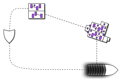
What Ward noticed is that his output might fit together nicely with my input. Like this:
A cycle of understanding

Here, the product owner begins with an executable graphical example of what she wants. The programmers produce code from it. As a user runs that code, she can at any moment get a bundle of pictures that she can point at during a conversation with the producer and other users. That might lead to some new driving examples .

The point of all of this? It’s a socio-technical trick that might entice users to collaborate in application development the way wikis entice readers to collaborate in the creation of, say, an encyclopedia. It’s a way to make it easier for markets to really be conversations. John Dunham dubbed this “crowdware”.

It won’t be quite as smooth as editing a wiki. First, as Naresh pointed out, the users will be pointing at pictures of a tool in use, and they will likely talk about the product at that level of detail. To produce useful driving examples (and software!), talk will have to be shifted to a discussion of activities to be performed and even goals to be accomplished. The history of software design has shown that we humans aren’t fantastically good at that. Adding more unskilled people to the mix just seems like a recipe for disasterware.

Wikis seemed crazy too, though, so what the heck.

Laurent Bossavit and I are working on a site. Once it reaches the minimal features release, I’ll add some crowdware features.
Nice exploratory testing story

From Sajjadul Hakim

Three guidelines for tests/examples (terse version)

  • Every word in the example should be about what the example is trying to show.

  • The intended audience is a human being asking first “How do I…?” and then “What happens when…?”

  • Possibilities should be grouped so you can see them all at once.

Examples “stage” at Agile 2008

Agile 2008 will be arranged around the metaphor of a music festival. There will be a main stage for the big-draw speakers, the larger tutorials for novices, etc.

I was asked to do a stage about testing that wouldn’t help shunt people into silos. (It shouldn’t be “the testing mini-conference”.) I decided the stage would take seriously the usefulness of explicit, concrete examples—executable or no—in the thinking about, construction, and post-construction investigation of software-ish things. Hence the logo:

Examples stage logo
(more…)

Functional testing tools workshop

Agile Alliance Functional Testing Tools Visioning Workshop
Call for Participation
Dates: October 11 - 12, 2007
Times: 8 AM - 5 PM
Location: Portland, Oregon
Venue: Kennedy School

Description
The primary purpose of this workshop is to discuss cutting-edge advancements in and envision possibilities for the future of automated functional testing tools.

This is a small, peer-driven, invitation-only conference in the tradition of LAWST, AWTA, and the like. The content comes from the participants, and we expect all participants to take an active role. We’re seeking participants who have interest and experience in creating and/or using automated functional testing tools/frameworks on Agile projects.

This workshop is sponsored by the Agile Alliance Functional Testing Tools Program. The mission of this program is to advance the state of the art of automated functional testing tools used by Agile teams to automate customer-facing tests.

There is no cost to participate. Participants will be responsible for their own travel expenses. (However, we do have limited grant money available to be used at the discretion of the organizers to subsidize travel expenses. If you would like to be considered for a travel grant, please include your request, including amount needed, in your Request for Invitation.)
(more…)

Test planning documents

I’m going to start copying my replies to questions on agile-testing here.

I am interested in hearing how people that don’t think a Test Strategy should exist go about answering the following questions and when they do it. […]

  • Number of testers required—including what skills they need (i.e. (Performance, Security, Domain Knowledge, Technical Knowledge) and where they will come from (current employee’s, contractors etc)

  • Environments, especially for new projects. What is going to be needed, how much will it cost, when will it be required. (Some hardware can take 6-8 weeks to source)

  • Data—what data will be used, where will it come from, privacy concerns

  • External/Dependant requirements—for example will real users be involved in UAT/Usability Testing? When will they be involved? (If it is “general” public this needs time to organise, if they are in another country/offsite do you want someone to be there to monitor/oversee what they are doing). Is a usability lab going to be used? Does the product need to be benchmarked by an external company? When? etc.

  • Software/Tools—if anything needs to be purchased this should be highlighted.

(more…)

Graphical workflow tests for Rails - alpha version released

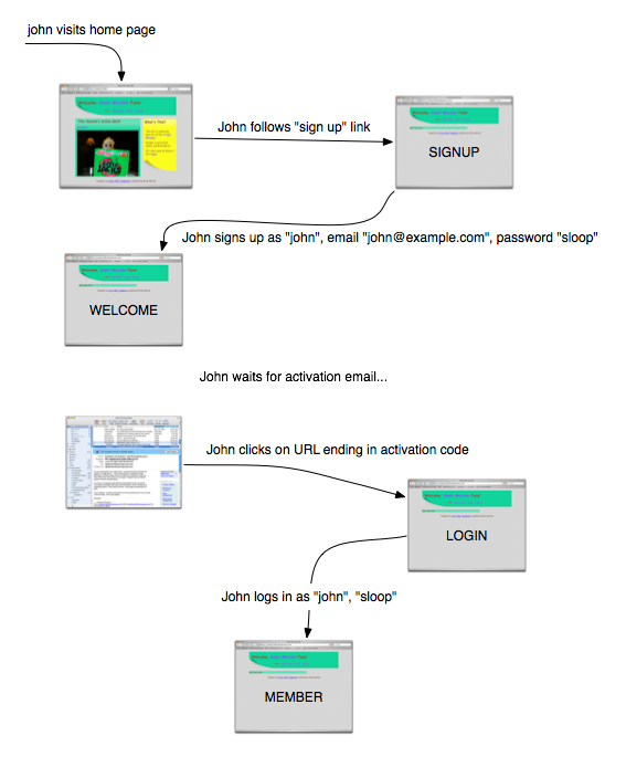
For many web apps, it’s important to get the user’s workflow right. Consider a Rails app that uses some variant of acts as authenticated to handle user registration and login. Here’s one way of describing an example of normal registration:

John visits the home page.
John follows the “sign up” link.
(John is now on the signup page.)
John signs up as “john”, email “john@example.com”, password “sloop”.
(John is now on the welcome page.)
John waits for activation email…
John clicks on a URL ending in an activation code.
(John is now on the login page.)
John logs in as “john”, password “sloop”.
(John is now on the member page.)

Here’s another:

A registration workflow

Which is better? If I were trying to design the workflow—get it so that it’s right for the users—I’d much rather use a picture (whether drawn in OmniGraffle, as this was, or on a napkin or whiteboard.) Why?

  1. It’s easier to “zoom out” from a picture, to ignore the details. When I do that, I’m more likely to notice missing workflows or stupidities in the ones that I have.

  2. As a designer, I’ll soon have to explain my thinking to others. It’s easier to explain a picture because it’s sitting right there in front of both of you, visible in two-dimensional space. It’s simple to refer to something you already mentioned: point at it. A wealth of context gets recalled by that simple gesture. If it’s not readily recalled, you can decorate the graphic with something that jogs the memory. Pictures make for a much more fluid way of communicating.

  3. Our minds are in bodies; and bodies have minds of their own. We think kinesthetically and visually, not (just) by banging propositions together according to the rules of some kind of logic. The more ways you think about something, the fewer mistakes you’ll make.

But there’s one big disadvantage of pictures from the point of view of the test-driven (behavior-driven, example-driven) programmer: they’re not executable.

Until now

I’ve released an alpha version of an open-source library that converts such pictures into Ruby tests. Below the fold, I show how the workflow picture becomes a Rails integration test.

✂——✂——✂——✂——✂——✂——✂——✂——✂——✂——
(more…)

Graffle 0.1.0 released

As far as I know, there’s only one other person in the world who cares about testing Rails apps from OmniGraffle documents. (Hi, Tom!) Still, since I always make a fuss to clients about how important it is to reinforce discipline and ease the release process by frequently releasing potentially usable product as widely as possible—and since I believe what I say—it’s time for a release:

The first, minimally bearable version of my OmniGraffle parser/decorator is available for download. You can also read the documentation online.

Picture of graffle documentation

Too much testing

Good points, entertainingly written, by Jason Gorman.

Since he’s a programmer enthused with testing, and allows exploratory testing in his worldview, and is in cahoots with Jonathan Kohl, I hope he figures out exploratory testing at the xunit level. The very flow that TDD provides acts as blinders on my ability to see anything other than my current path. I have to pull back and shift focus. I don’t know how to do that well.

For example, I just added groups to my fledgling Graffle parser. Previously, the object at the end-point of a line had to be at the same nesting level as the line itself (since there was only one level). When I wrote the code to find the end point in a multi-level document, a test that surprisingly didn’t pass after I wrote the code made me realize a null check needed to be a responds_to? check. I made the change and moved on.

Is that all I should have realized? Maybe the unexpected failure means that there’s something odd in the way I’m thinking about things that are Nestable and things that are Containers and things that are both. But how do I know, at a particular point, whether I should stop to think or move on? And how should I think when I stop? What’s the equivalent of the mnemonics and rules of thumb that James Bach and Michael Bolton are famous for?

More than a decade ago, I had some modest heuristics in my The Craft of Software Testing. But those were derived from looking at bugs in big chunks of C code, and they were concentrated on the question “did the programmer do what she intended?” Today, that question is (among better programmers) “yes” often enough that different ones have become more prominent: “has the programmer grasped the problem? has she intended to do the right thing? what has she overlooked?”

More research is needed. More discussion, too. Another excuse for a mini-conference.

A workbook for practicing test-driven design (draft)

Summary: I wrote a workbook to help people learn test-driven design. Want to try it out?
(more…)